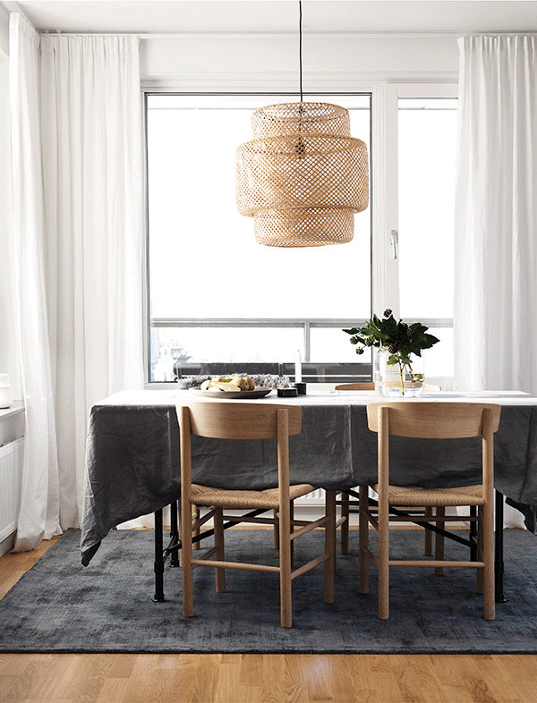
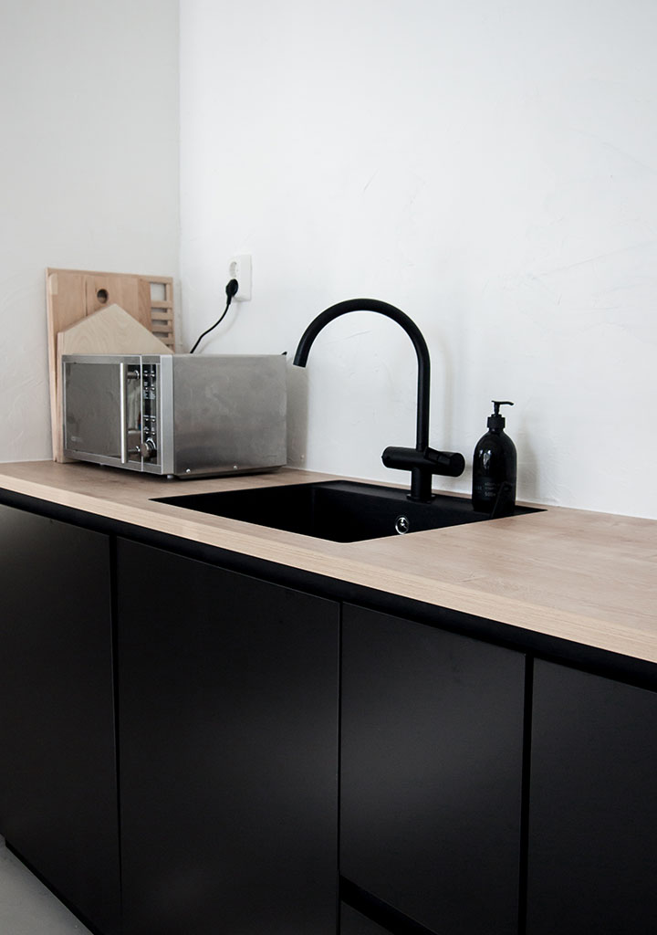
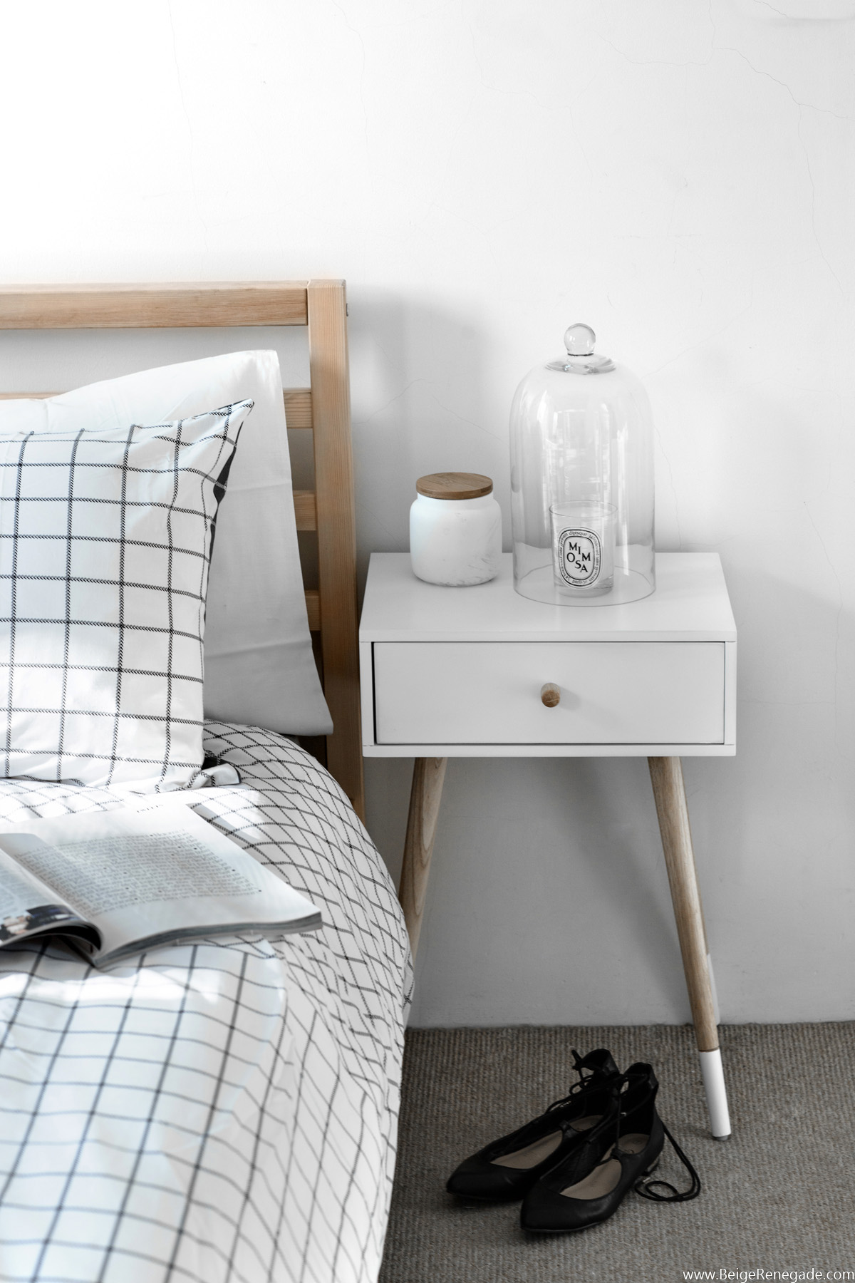
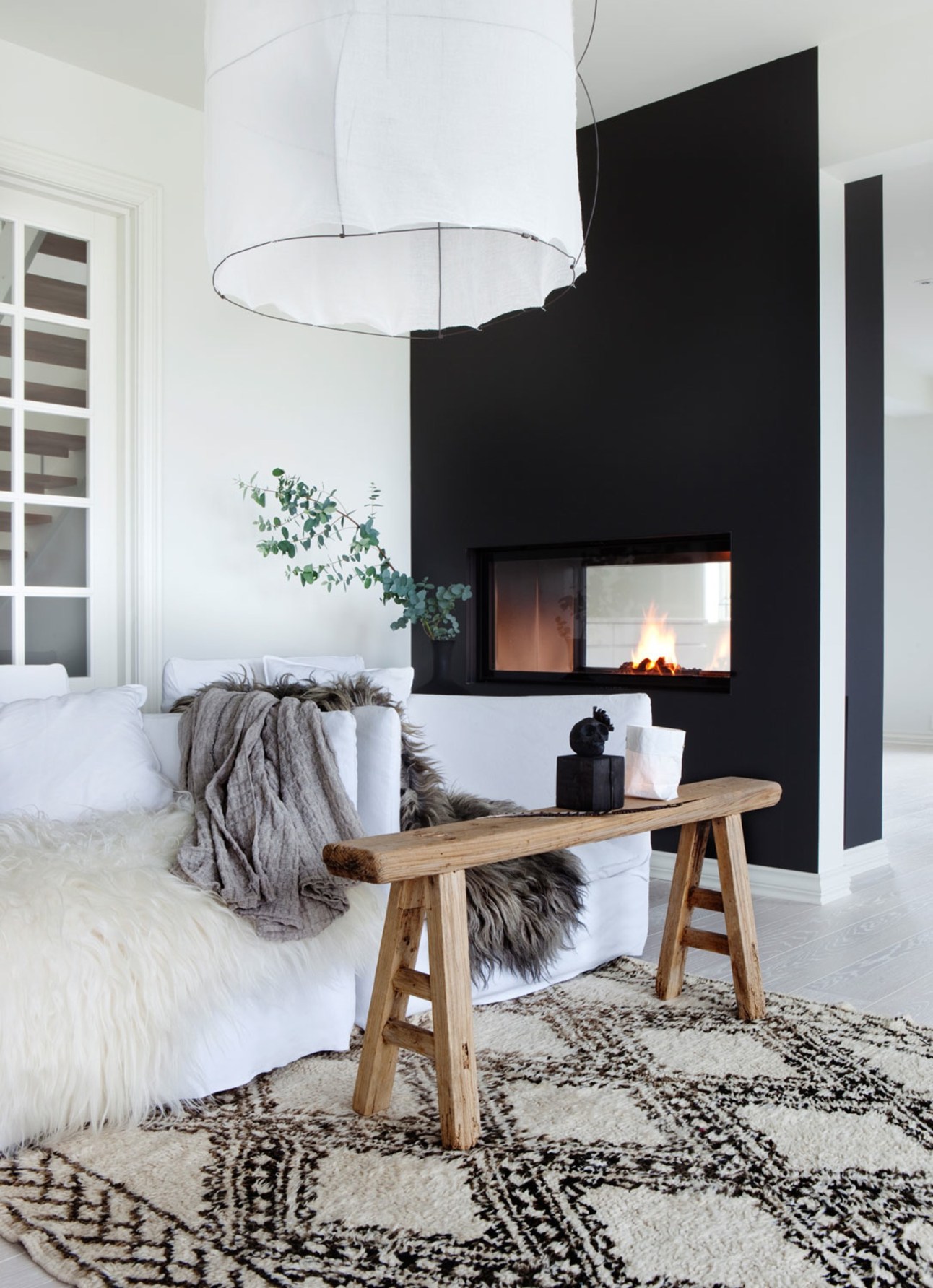
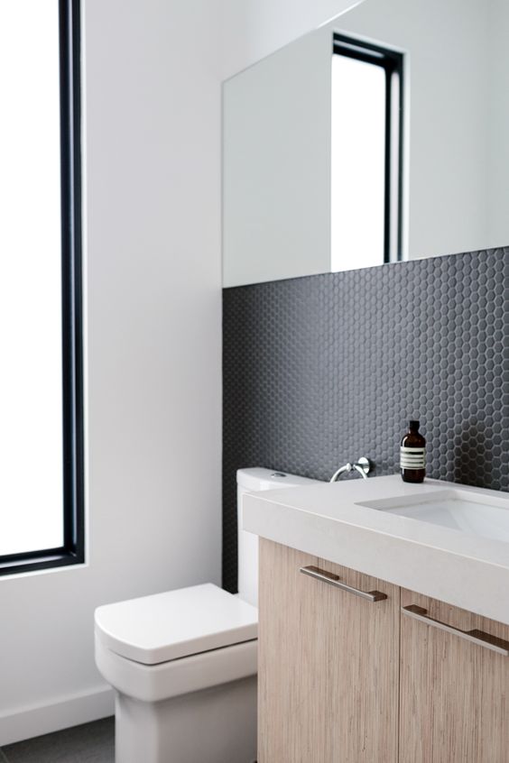
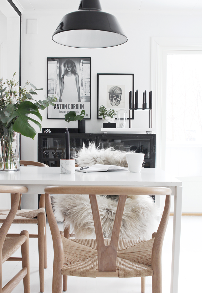
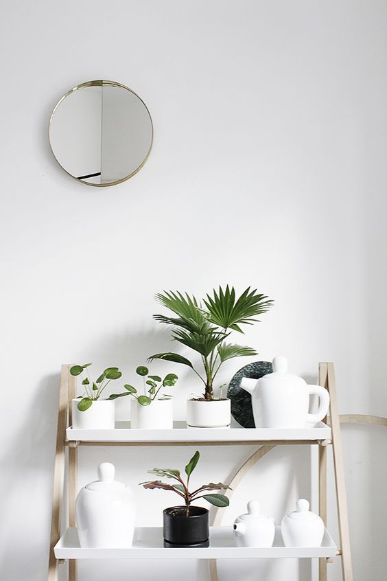
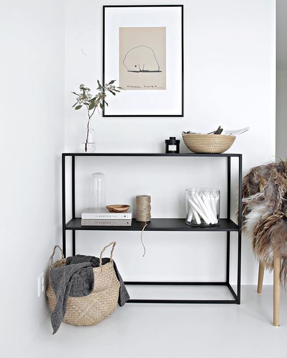
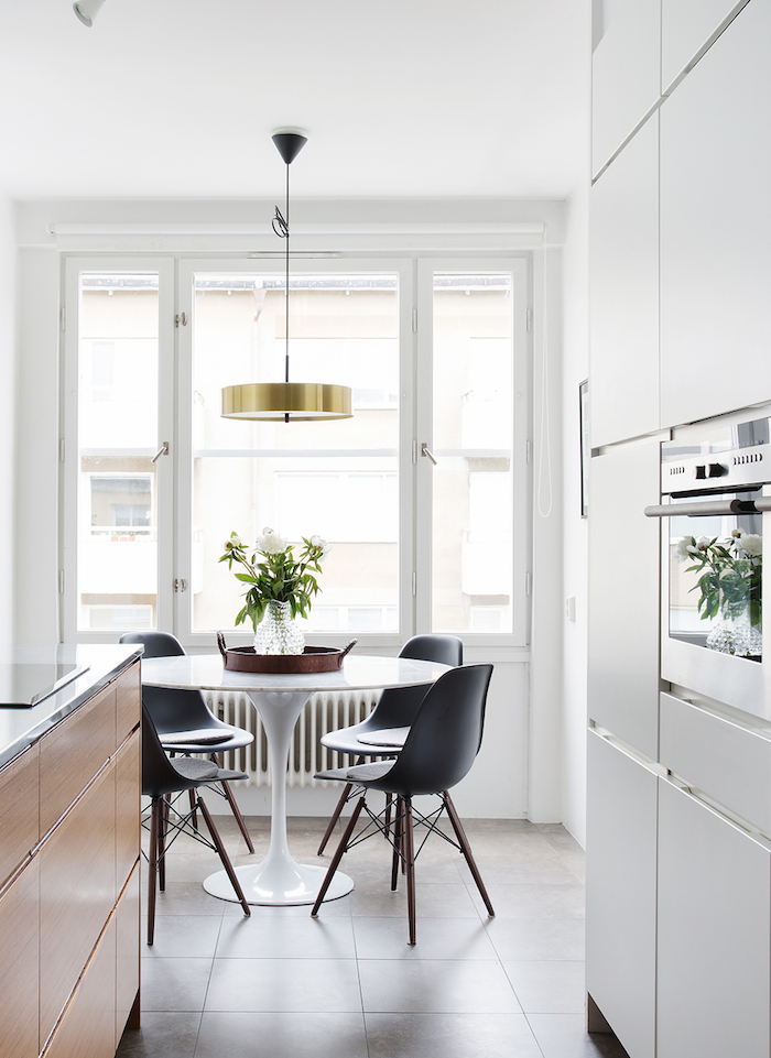
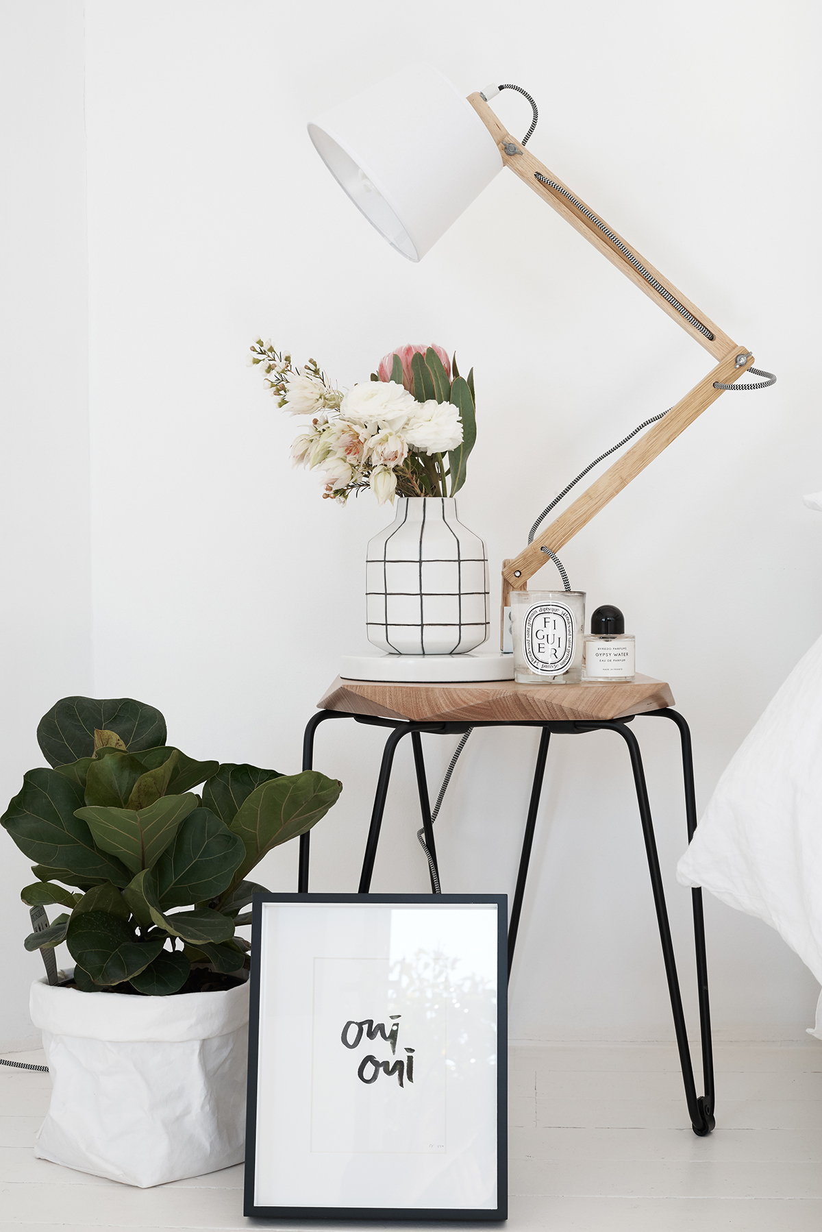
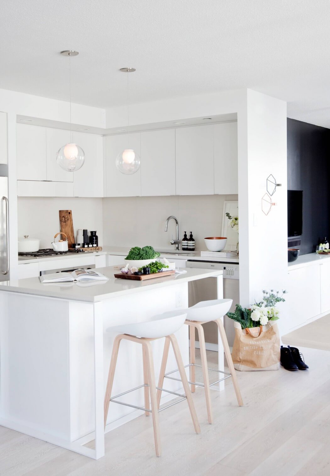
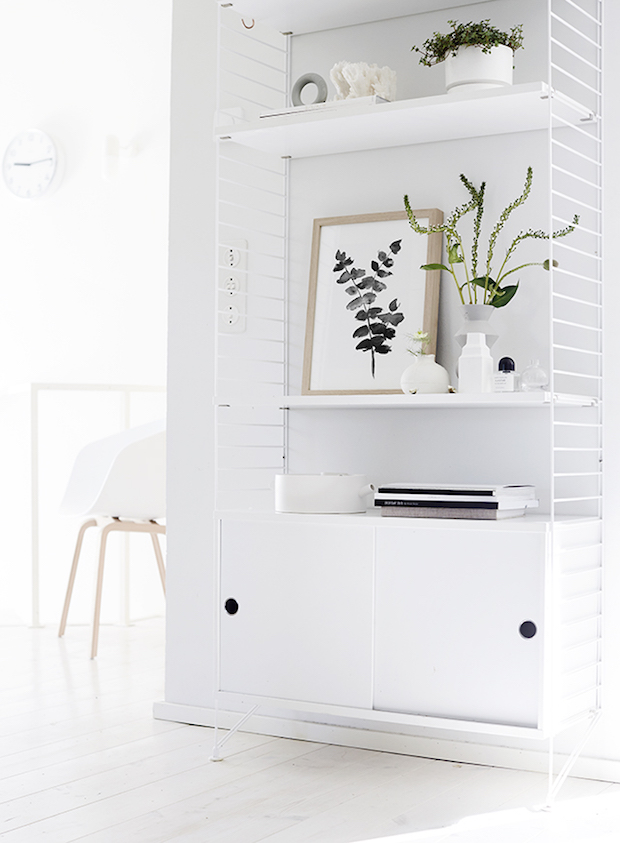
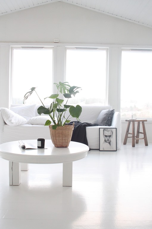
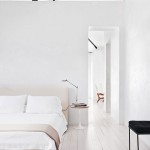
The most common commentary I see about black and white spaces is that they can look too cold and stark, and while I’m still a crazy fanatic over the look, I see that point and have sometimes found myself looking for ways to warm up a monochrome scene. Adding in light, natural wood has become a favorite go-to of mine and what I tend to fall back on for that warm minimalism that still remains neutral but adds a little more dimension, that something something. It works in both small and large doses, and texture is definitely at play for making things more interesting. Let’s see!
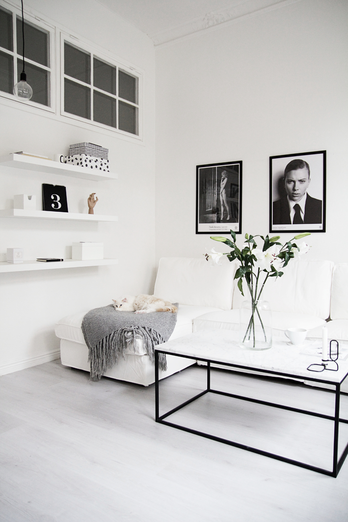
It’s just that small little hand, but it makes such a difference, no? The cat helps, too.
Images: 1 | 2 | 3 | 4 | 5 | 6 | 7 | 8 | 9 | 10 | 11 | 12 | 13 | 14

That is perhaps the best combination ever created!
Haha perhaps! So many good ones but this is way up there for sure.
I agree :)
Minimalist does not mean sterile, stark and uninteresting. It just represents the absence of unnecessary “too much” in the way of elements in the space. Too much unscaled furniture, too many small accessory items, too many textile textures, too much color that argues, etc. You have successfully, in my opinion, created a space that is in great balance with all the elements. I love the natural wood accents. Really softens the look of the space. Perhaps adding just ONE vibrant color here or there would create little spots of interest. Coral? Turquoise! Oh heck, how about RED!!?? lol Thanks for letting me feel like I can contribute honest comments. Great job!!!
Linda. This comment is everything. Thanks for putting it so perfectly, and please, your comments are always welcome!!!
Also, thanks for the amazing compliment. My search for minimalism is always conflicting with my love of lots of stuff HA, so it’s encouraging to hear that I might be doing something right ;)
I just discovered you on IG and am following you now. I love your aesthetic and plus, you’re a Korean blogger! :) I’m a mom blogger also from So Cal. Glad to connect!
반갑습니다! So nice of you to take a moment to stop by and introduce yourself. Thank you!
At this point, I consider myself a color minimalist.But, I find myself swooning over monochromatic and Scandinavian style. Let’s put it this way, our taste changes with time, situations, trends and many more factors are involved. We have to just enjoy our journey through all of these phases.
Have a great day:)
Much agreed. Took me a long time to figure out what I like at this point and who knows how that’ll change in a few years. Or maybe taste will remain ;) It’s all fun!
Fantastically Minimalist
Always a great combination! I never really see this combination going away. Very timeless and beautiful. I really love that you share so much black and white, minimal interior style.
Definitely timeless! Very glad to hear you’re enjoying the inspo, thank you Josette!
you are inspiring me a lot!!!! house goals!